
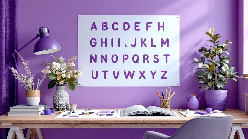
How to Properly Space Alphabet Stencils for Even Lettering
Have you ever looked at your art and thought, "This lettering could be a bit better?" I’ve been there, staring at uneven letters, feeling the weight of imperfection. But there’s a way to transform that frustration into mastery. Let me take you on a journey through the art of spacing alphabet stencils for even lettering.
Using Guidelines
Guidelines are your secret weapon. As I slowly lay out my design, I draw faint lines a quarter of an inch apart. It’s like creating a road map for my letters. The first letter rests snugly against the center guideline. And then, I carefully position the next letter, ensuring it mirrors the first.
When the last letter is in place, I step back. Everything feels right. The guidelines maintain uniformity, and my text stands proud and centered. The satisfaction from this simple technique is immense.
Choosing the Right Stencils
Not all stencils are created equal. I’ve learned that selecting stencils with uniform sizing is crucial. Masking alphabet stencils, where each letter snugly fits within the same size square, simplify the alignment. It’s a magical moment when each letter aligns effortlessly, creating a seamless flow regardless of my chosen text length.
Customizing Your Stencils
Art is not about strict adherence to rules. Sometimes, I prefer to adjust the spacing or connection of letters according to my vision. I can choose to leave gaps or connect certain parts, breathing life and personality into each letter. The canvas transforms, and it’s a thrilling experience to see my ideas materialize.
Using Rollers and Gel Plates
When I face bigger projects, I pull out my trusty rollers. These tools change the game. A few swipes and I’ve applied even coats of paint across multiple letters, saving me valuable time. After wrapping them in plastic, they remain ready for my next session—maintaining their dampness while I dive back into creativity.
Preparing and Organizing Letters
Efficiency is key. I cut out all my letters ahead of time, organizing them into small envelopes, which makes my workflow seamless. The act of sorting my letters alphabetically feels oddly satisfying—I know that each piece is ready for action.
Utilizing Stencil Fonts
Flexibility is my friend, especially when diving into custom projects. Stencil fonts are particularly useful, having built-in bridges to keep the letters intact. On top of that, services like Bay Stencil offer the ability to create custom stencils in any font. No more worrying about structural integrity; I can focus solely on my artistry.
Step-by-Step Process
Step 1: Prepare Your Guidelines
Start by marking your surface with even guidelines. This foundational step sets the tone for your lettering adventure.
Step 2: Choose Your Stencils
Take your time selecting stencils designed for uniform spacing. This choice will guide your success.
Step 3: Align Your Letters
Use the guidelines to place each letter meticulously. I ensure the right side of each letter touches the guideline, creating that much-desired alignment.
Step 4: Adjust as Necessary
If things don't look right, I don’t hesitate to adjust. Experimentation adds personality to my work.
Step 5: Apply Paint
With rollers at the ready, I apply paint to my stencils, ensuring everything remains vibrant and alive.
Tips for Perfect Alignment
- Use a center guideline for perfectly centered text.
- For longer quotes, visualize the overall length as you stencil, and adjust as needed.
- When precision is vital, a trusty pen can help me fine-tune each letter.
By embracing these steps, I confidently create evenly spaced, professional-looking text with alphabet stencils. Every stroke reaffirms my love for art and the satisfaction it brings. In the end, it’s not just about the letters—it’s about the stories they tell and the emotions they evoke.
Now, imagine standing back and admiring your work, with each letter firmly in its rightful place. That feeling? It’s something every artist longs for. So, grab your stencils and start creating!